
The Client
The MyFlow Method combines movement, sound, and visual stimulation into a structured 14-minute multisensory experience that helps people reset their nervous system, regain focus, and restore energy in demanding environments.
My Role
Brand designer and art director, leading the identity from strategy through to delivery: logo, brand guidelines, website, a digital product design, and a suite of B2B formats.

The Solution
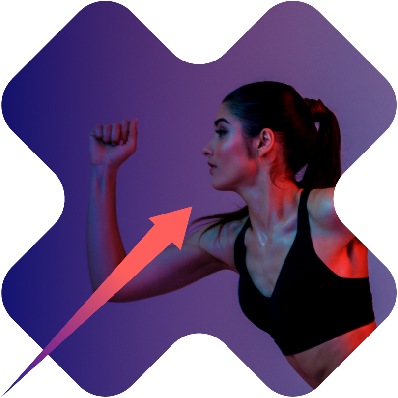
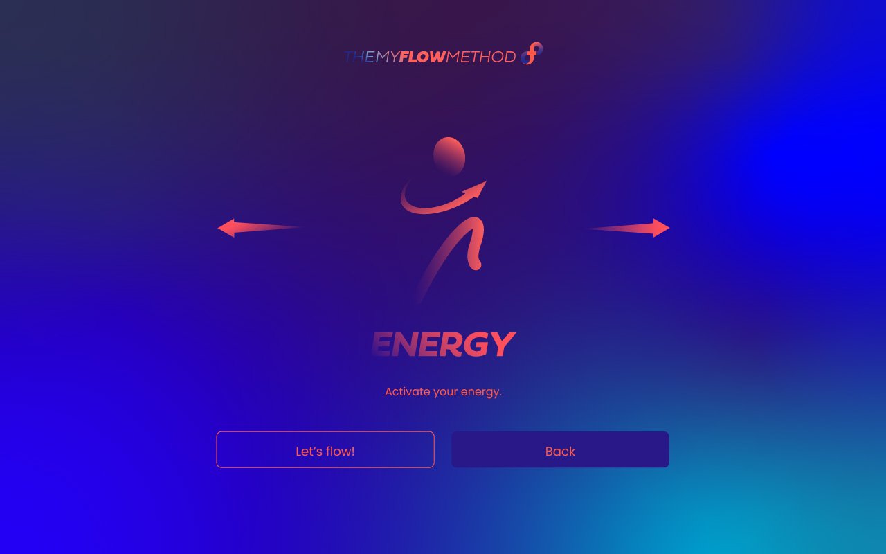
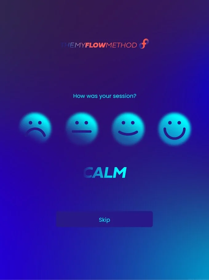
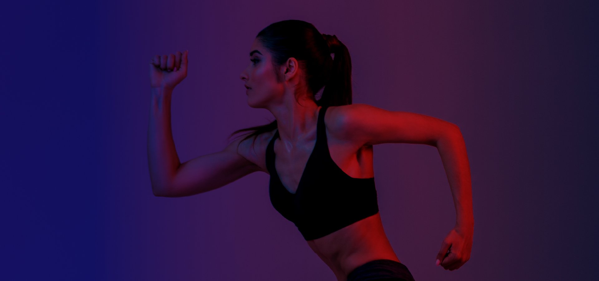
The identity grew directly out of the experience itself. Gradient colour carries the sense of movement and transition; footage from real sessions keeps the brand human, countering a concept that could otherwise read as too clinical or abstract.
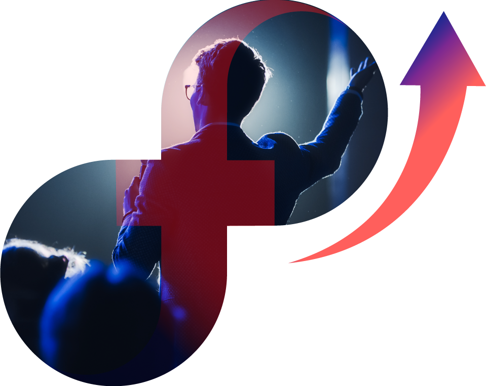
At the centre sits the symbol, an infinity "f", where the brand name and the idea of continuous flow become one mark. That form then extends into a wider iconographic language that runs through every touchpoint.