Crafting a Vision: Developing 210 Studio's Distinctive Identity
The Client
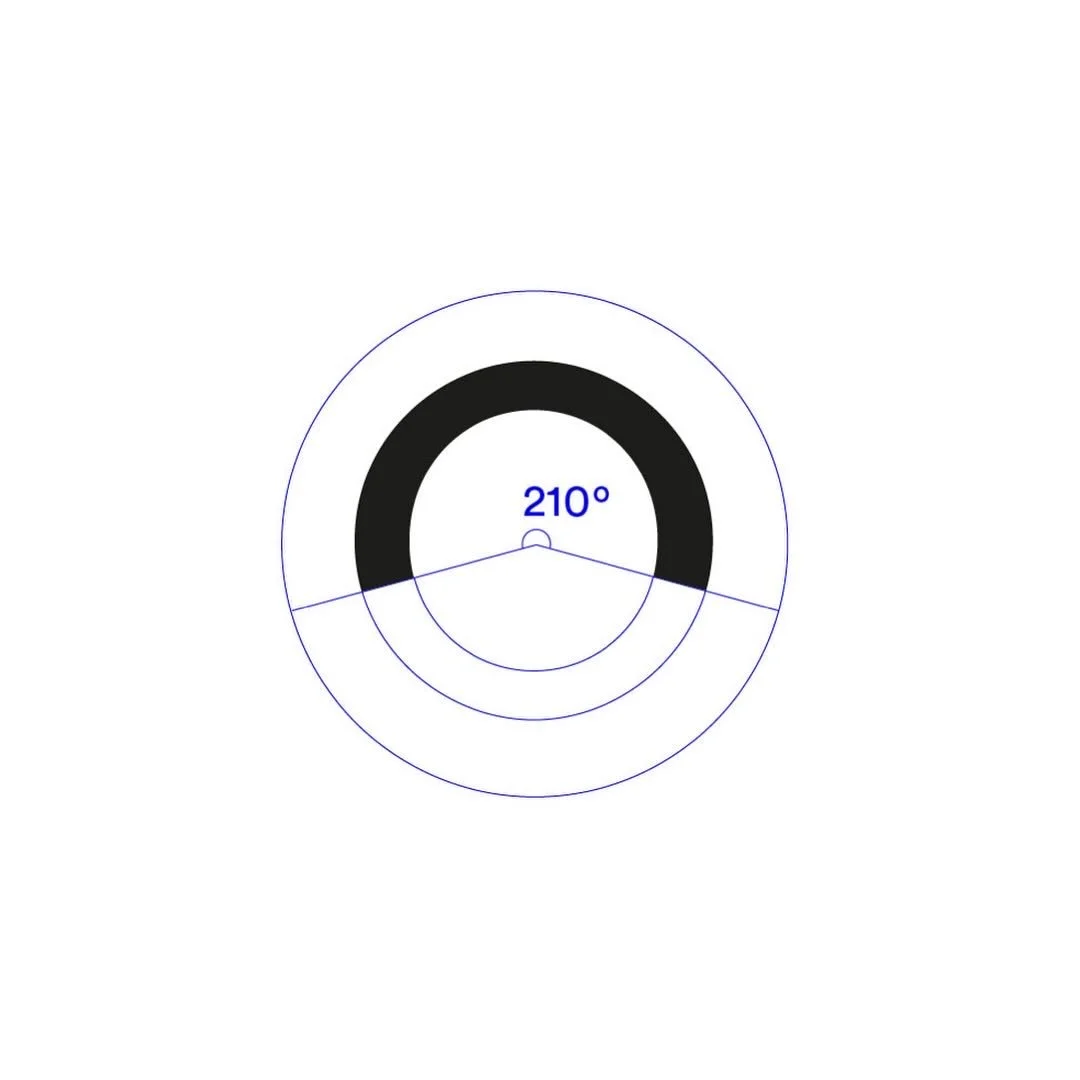
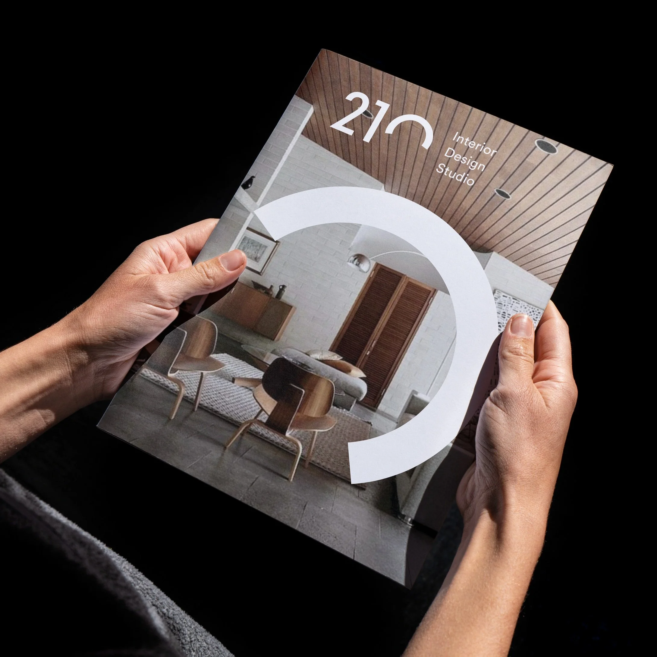
210 Studio is a small but ambitious interior design practice. The name relates to the fact that the human’s visual field has a 210-degree angle.
The Objective
To develop a core and flexible identity that communicates their design approach: eye-pleasing, human friendly and eclectic solutions for a broad range of interior spaces.
The Solution
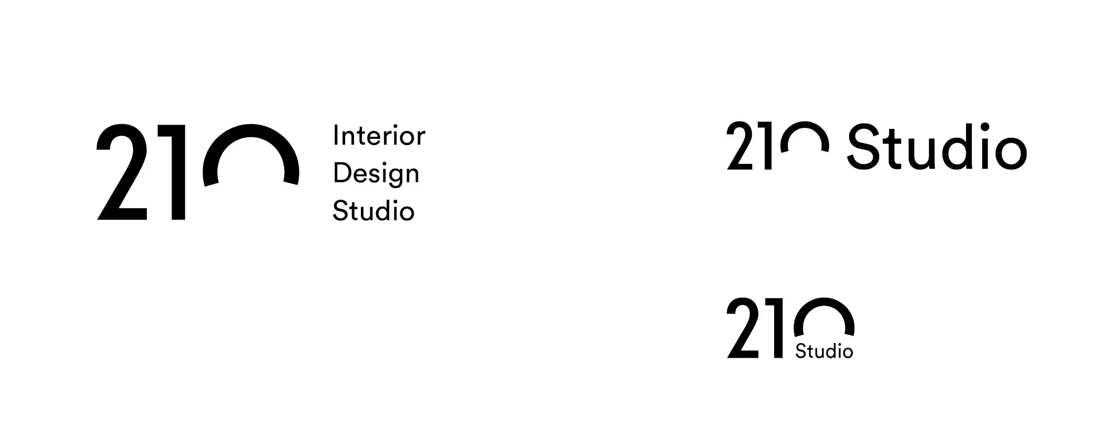
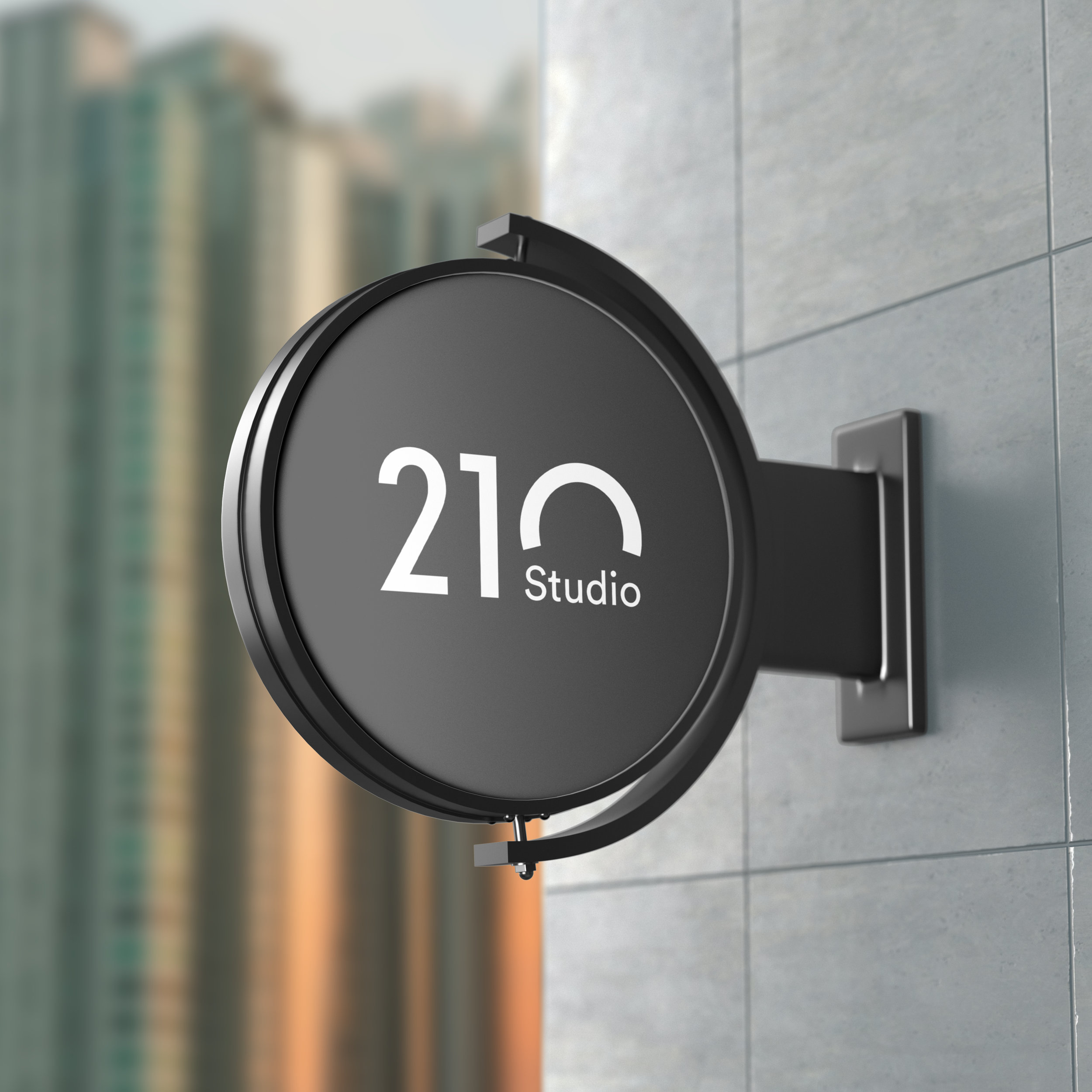
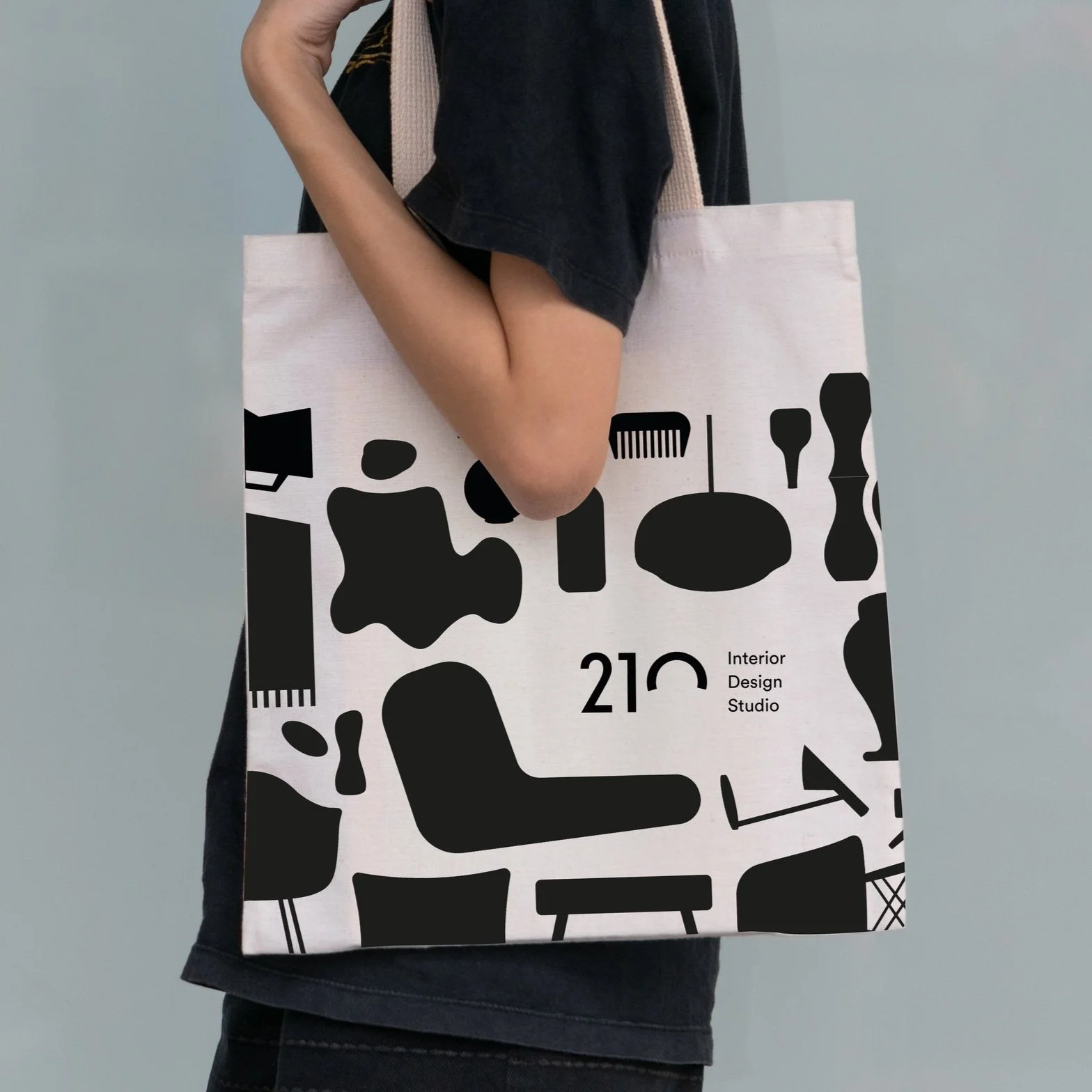
The logotype was created by intersecting the circular zero with a 150-degree angle, leaving us with a 210-degree shape. I used the perfectly geometrical Circular font to complement the concept.
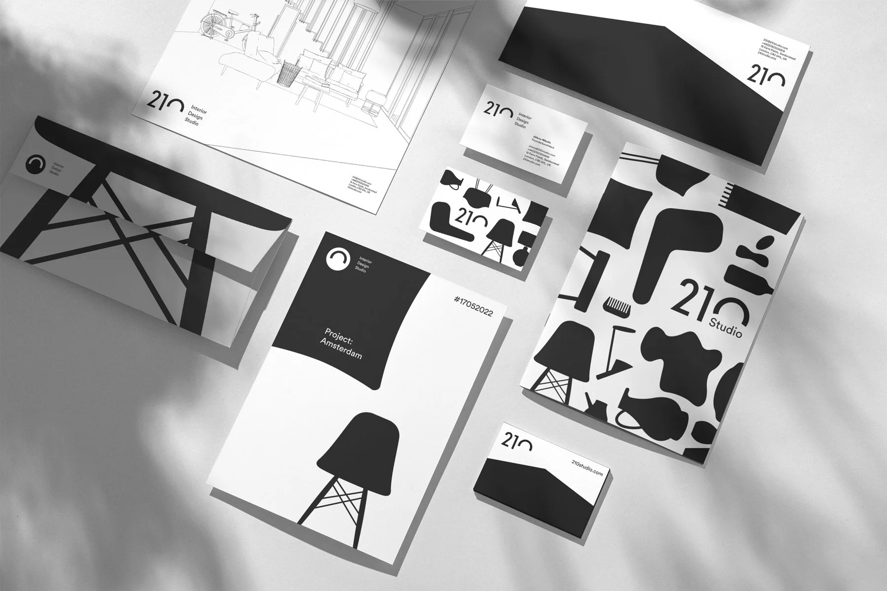
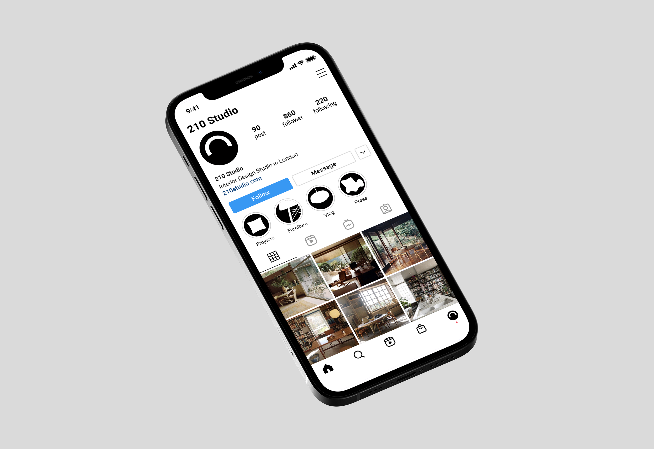
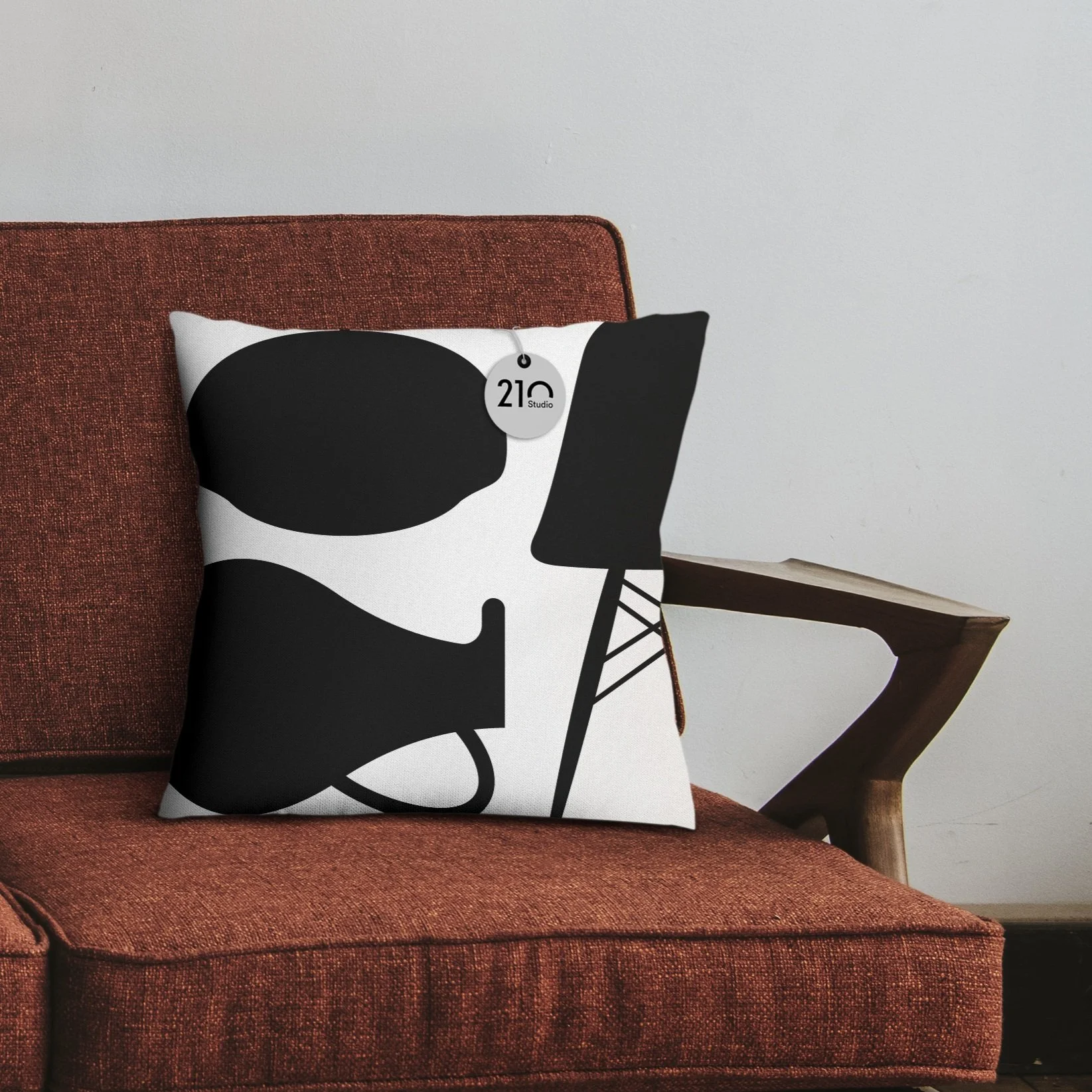
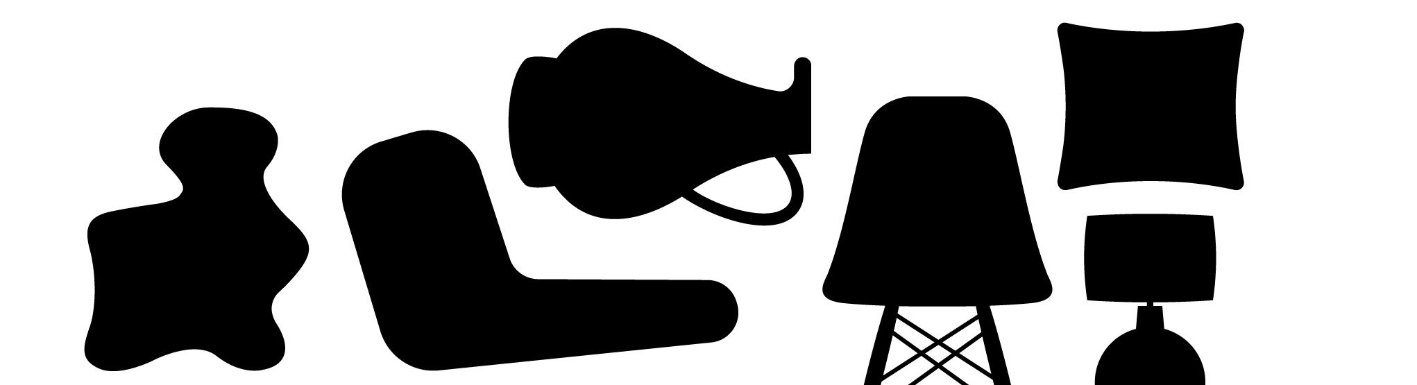
The overall visual language follows that same simplicity and playfulness: a family of stylised monochrome furniture shapes and design objects forming endless patterns that spread across business stationery and other communication formats.